You built a stunning cannabis website. You carefully selected colors you love, maybe a soothing green or an earthy brown. But what if your personal preference is driving potential customers away?
In the world of digital marketing, color is not just an aesthetic choice; it’s a conversion tool in the cannabis industry, where trust, relaxation, and premium quality matter. Using the wrong color palette could be silently killing your sales.
The Psychology of Color in Cannabis Branding
Color influences perception. It triggers emotions and shapes decisions. Blue radiates trust and stability, making it a favorite for banks and tech firms. Red ignites urgency, which is why clearance sales always flash it. But when it comes to cannabis, you need to ask: What does your audience expect?
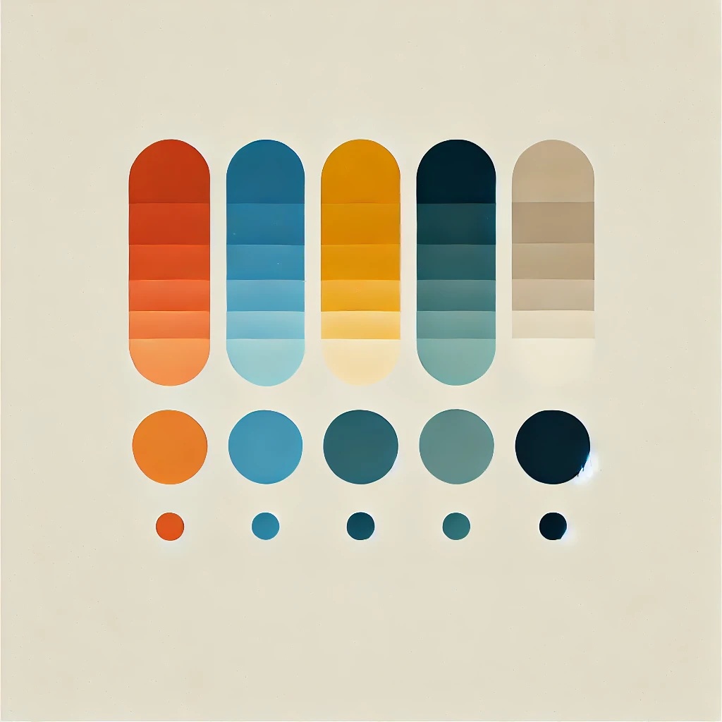
- Green: It is no surprise that it symbolizes nature, wellness, and sustainability. But if overused, it can feel generic, blending you in rather than setting you apart.
- Black & Gold: Luxury brands use these for a reason. They signal exclusivity, premium quality, and high-end appeal, which are perfect for brands catering to connoisseurs.
- Purple: Often associated with creativity and relaxation, it is an interesting choice for brands selling indica-heavy products or CBD.
- White & Pastels: Clean, modern, and minimalistic. These colors can make your brand look fresh and medical-grade, a great fit for health-focused cannabis brands.
- Red & Orange: Bold and energetic. If your brand thrives on excitement and impulse buys (think pre-rolls, vapes, and edibles), this could be your winning move.
The Science Behind CTA Colors That Convert

Your call-to-action (CTA) button is where interest turns into action. If it blends into your website, you’re throwing away potential sales. The key is contrast.
Here’s what the data says about CTA button colors:
- Red & Orange: High energy, ideal for pushing urgency-driven conversions like limited-time offers.
- Green: Works well for health-conscious audiences but can sometimes blend into the background.
- Blue: Trusted but not always the best for creating a sense of urgency.
- Yellow: Great for grabbing attention, but use it sparingly to avoid overwhelming the page.
- Black & Gold: If you’re a luxury cannabis brand, these can create an aura of exclusivity that drives high-ticket purchases.
The Importance of a Cohesive Color Scheme
A successful cannabis brand doesn’t just choose colors at random; it builds a cohesive color scheme that enhances brand recognition and trust. A well-thought-out palette ensures consistency across your website, packaging, social media, and marketing materials.
A harmonious color scheme does more than make your brand visually appealing; it helps customers instantly recognize and remember your brand. It also conveys a sense of professionalism and trustworthiness. Whether you’re aiming for a calming wellness brand, an upscale luxury experience, or a high-energy recreational vibe, your color choices should be intentional and strategically aligned with your brand’s identity.
Test, Don’t Guess
Choosing the right colors isn’t about what you like; it’s about what works. The only way to know for sure? A/B testing. Test different color palettes and CTA button shades. See which ones drive the most engagement and sales.
At Spokes Digital, we specialize in crafting high-converting cannabis websites that align with audience expectations. We don’t guess; we test, analyze, and optimize.
Want to see how a simple color tweak could boost your conversions? Let’s talk.
Your brand’s success isn’t about what you like. It’s about what sells.